
What Should a Nutrition Label for Synthetic Media Say?
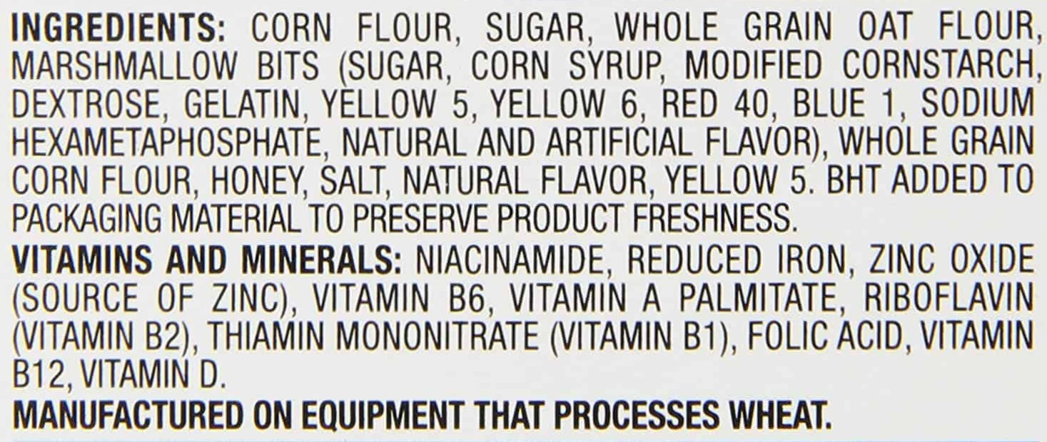
Imagine pouring a bowl of cereal, grabbing a spoon, and getting ready to read the back of the box while you eat (there is no finer literary experience). You’d be surprised if there was no nutritional information, no indication of whether it’s organic, made from whole grains, or comes with 5 kinds of ‘magically delicious’ marshmallows. That’s essentially where we are with AI-generated and AI-enhanced imagery today.
At Starling Lab, we’ve been prototyping what we call a “nutrition label” for synthetic media, intended to be a standardized way of communicating what audiences are actually looking at. After months of experiments and dead ends, here’s where our thinking has landed.
The problem we’re addressing is when someone views a 3D reconstruction or an AI-enhanced photograph, they have no way of knowing:
What source material was used, how much of what they see is captured vs. AI generated, what tools and processes created the output, and who made key decisions and when.
This information exists but it’s not revealed to the viewer.
Our goal isn’t to make everything look suspicious or to undermine the enjoyment of immersive experiences. It’s to give audiences the information they need to evaluate what they’re seeing. A 3D reconstruction based on 500 authenticated photographs of a real-world scene would likely mean something different to an audience than one generated from a single image and creative prompting, or even no source image at all.
We’ve identified five categories of information we think a nutrition label should include.
Source Summary: How many source assets? What types (photo, video, LiDAR)? What percentage of the output is directly derived from source material vs. interpolated/generated?
Example: “Based on 47 photographs. Approximately 60% of visible content derives from source imagery.”
Generation Disclosure: Were generative AI tools used? For what purpose? This isn’t about banning AI—it’s about transparency.
Example: “Depth estimation enhanced with AI. No content generation tools used.” Or: “Scene extended beyond source frames using diffusion model.”
Provenance Chain: Can the source material be authenticated? Is there a cryptographic trail linking this output to verified originals?
Example: “Source images authenticated via C2PA. Verification available.” [Link]
Modification History: Has this asset been edited since initial creation? By whom? When?
Example: “No modifications since initial processing. Created: March 15, 2025.”
Confidence Indicators: For spatial reconstructions, where is the model confident and where is it uncertain? This might be communicated visually rather than textually.
Example: “Areas in blue overlay indicate lower reconstruction confidence.”
Listing this information is easy. Designing a UX to present it without killing the experience is hard. Nobody wants to read a paragraph of metadata before exploring a 3D scene reconstruction. But that information needs to be accessible for people who want or need to know.
Our proposed approach uses layers to accommodate both casual viewers who just want the experience and careful consumers who need verification.
- At-a-glance indicators: A simple badge or border color that communicates overall trust level. Green for fully authenticated source material with no generation. Yellow for mixed. Red for significant generation or unknown provenance.
- One-tap summary: A single tap reveals the five categories above in readable prose.
- Full provenance: For experts who want to dig deeper, the complete cryptographic record is accessible—every hash, every signature, every registered ledger entry.
Creating this label has forced us to confront questions we don’t yet have clean answers to.
The most fundamental is where the line falls between enhancement and generation. If I use AI to sharpen a blurry photograph, most people would call that enhancement. If I use AI to generate an entirely new scene from a text prompt, most people would call that generation. But the interesting cases live in between, and they’re the ones that matter most for spatial media. AI-assisted depth estimation—the technique that tools like Apple’s SHARP use to infer 3D structure from a flat image—doesn’t add any pixels. Every pixel in the output comes from the original photograph. But the spatial relationships between those pixels are entirely inferred by a model. Is that enhancement or generation? Reasonable people disagree, and the answer probably depends on what the output is being used for. A museum exhibit and a courtroom presentation have different stakes.
Then there’s the question of thresholds. Should every automated process be listed, or only those above some significance level? Who defines “significant”? A depth estimation step that’s invisible to a casual viewer might be the single most important piece of information for an investigator trying to assess whether a spatial reconstruction reflects ground truth. We haven’t solved this. Our current approach is to disclose everything and let the layered UI handle the complexity, but that pushes the problem to the UX layer rather than resolving it.
A voluntary label is only useful if it’s adopted. We’re working with industry partners, but there’s no central authority that can mandate compliance. And right now, the organizations most likely to adopt transparent labeling are the ones that least need it – institutions already committed to accuracy. Nothing stops bad actors from falsely labeling fabricated content as authentic. The label creates accountability for those who use it honestly; it doesn’t prevent deception by those who don’t.
We’ve built a working prototype that embeds this information in ComfyUI AI outputs as well as Gaussian splat files and surfaces it in web-based viewers. Some things work. The metadata embedding itself is straightforward—C2PA content credentials can carry all five categories of information, and our pipeline successfully writes and reads them. The layered UI concept holds up: test users consistently ignored the at-a-glance badge until they wanted it, which is exactly the behavior we were designing for.
Other things don’t work yet. Our visual indicators showing where a reconstruction is certain vs. uncertain are crude. They communicate the concept but they’re not production-quality, and the visual language for “this area is less reliable” hasn’t been solved by anyone. More fundamentally, the label doesn’t survive format conversion. Export a labeled Gaussian splat to a video for social media and the provenance data is stripped. That’s not a bug in our prototype; it’s a gap in the ecosystem.
Our UX is imperfect but it demonstrates that provenance information can travel with spatial media the same way ingredient lists travel with packaged food. If you’re working on similar problems, whether in content authenticity, spatial computing, or UX for trust signals, we’d like to hear from you.
Spatial Lab is a publication of Starling Lab, a joint initiative of Stanford University and USC focused on data integrity. We cover spatial intelligence technologies for journalism, law, and historical documentation.